
High‑Converting Website Design: Practical UX Principles to Optimize Conversions
A high‑converting website turns visitors into measurable business results by pairing a clear value proposition with low‑friction UX and purposeful conversion elements. This guide lays out the core principles of conversion‑focused design, shows how UX best practices move the needle on CRO, and highlights the tactical changes that deliver the biggest ROI. You’ll get practical patterns—navigation, mobile‑first layouts, CTAs, microcopy, and performance fixes—that increase leads, sales, and engagement while keeping brand trust intact. We map psychology and UX mechanics to design choices, provide a compact EAV-style audit framework, and share actionable CRO steps you can run immediately. Throughout, we pull from local, implementation‑first examples and an agency perspective so marketers and business owners can move quickly from diagnosis to prioritized action.
What Makes a Website Truly High‑Converting? Core Concepts and Benefits
A high‑converting site is built to turn intent into action by aligning UX, messaging, and technical performance with where a visitor is in their decision journey. The approach is simple: remove friction, make the value obvious, and guide attention so people complete target actions—contact, sign up, or buy. The payoff is better acquisition efficiency: more qualified leads or sales per visitor so marketing spend delivers predictable growth. Recent patterns show that speed, visible trust signals, and a crystal‑clear above‑the‑fold value proposition strongly correlate with conversion lifts—design for those and you get consistent results.
High‑converting sites share a few quick‑to‑check traits:
- A concise above‑the‑fold value line that answers “what” and “why” at a glance.
- Clear, benefit‑led CTAs placed where users are ready to act.
- Trust signals (testimonials, reviews, badges) visible close to conversion points.
Those traits point straight to the next step: decide which core elements to prioritize in design and testing.
What Are the Core Elements of High‑Converting Websites?
The conversion stack includes hero messaging, CTAs, social proof, navigation, forms, and page performance—each playing a specific role in the funnel. The hero quickly communicates the main benefit, CTAs create the action path, and social proof eases decision anxiety. Navigation and information architecture surface conversion paths so visitors find relevant offers fast, and forms capture leads with the fewest fields necessary or via progressive profiling. Together these elements form a disciplined conversion flow: persuasive messaging up top, trust and proof in the middle, and low‑friction capture at the end.
For fast audits, focus on placement and clarity: keep the primary CTA in or just below the hero, limit top‑level nav to conversion pathways, and trim form fields to essentials. Auditing these areas reveals the highest‑impact tests to run first.
Why Conversion‑First Design Matters for Growth
Conversion‑focused design delivers predictable business outcomes because small percentage gains compound across traffic. A modest 10% uplift in conversion increases leads or revenue proportionally—without raising ad spend—so acquisition becomes more efficient and margins improve. Better conversions also improve downstream metrics: higher quality leads shorten sales cycles and lift close rates. That makes speed, clarity, and trust especially important for small and mid‑sized businesses where each lead carries real value.
When you understand how incremental UX changes scale into revenue, you prioritize experiments that hit high‑traffic pages and high‑friction spots first to capture the biggest wins.
Retail Website Design’s Impact on Conversion Rates
Nearly 96% of website visits end without a purchase. This study analyzes how retail website design features relate to online conversion rates using regression methods. The findings show specific design elements significantly affect conversion performance.
An examination of retail website design and conversion rate, WC McDowell, 2016
How UX Design Raises Conversion Rates: Practical Best Practices

UX improves conversions by matching user intent with streamlined flows, lowering cognitive load, and making the highest‑value actions obvious and easy. When users find relevant info fast, trust the source, and face minimal friction, they’re far more likely to convert. That shows up as higher CTA click‑throughs, more form completions, and lower bounce—metrics that feed into CRO programs.
Prioritize accessible navigation, mobile‑first layouts, progressive forms, and a clear visual hierarchy. These practices move measurable KPIs—time‑to‑first‑action, micro‑conversions—so your testing and analytics should focus there.
What Makes Navigation and Information Architecture Intuitive?
Good IA and navigation make conversion paths discoverable within two or three interactions. Group pages by task, prioritize conversion destinations, and use clear labels with progressive disclosure so users aren’t overwhelmed. Menus should spotlight primary offers, and contextual CTAs inside content should shorten the path from discovery to action. A quick audit: verify three‑click access to key offers, consistent labels across devices, and analytics‑backed path mapping to confirm common journeys.
Pushing conversion pathways in IA reduces distractions and clarifies content hierarchy—both of which increase completion rates.
Why Mobile‑First Design Boosts Conversions
Mobile‑first design optimizes for the majority of users on phones—bigger tap targets, simpler flows, and fast loading. It reduces interaction cost: CTA placement within thumb reach, one‑tap actions, and concise copy that communicates value quickly. Mobile patterns like sticky CTAs, pared‑down forms, and prioritized content blocks lift mobile conversions by respecting device constraints and context. Always test on real devices and track mobile performance metrics to capture the gains.
Designing for mobile first forces clarity and removes unnecessary content—benefits that improve conversion across all devices.
Optimizing Web Site Conversion Rates: A Practical Guide
Part II of this book focuses on optimizing conversion for the visitors who do reach your site. It breaks down the steps for generating conversions and offers actionable advice to improve site performance.
Convert!: Designing Web Sites to Increase Traffic and Conversion, 2011
Which Website Elements Drive the Most Conversions?
The tactical elements to optimize first are: hero value proposition, CTAs, social proof and trust signals, streamlined forms, and page speed. Each affects a specific metric—hero messaging lifts engagement, CTAs drive clicks, social proof increases completions, and speed prevents abandonment. Prioritizing in that sequence helps teams concentrate on the highest‑impact changes and measure results clearly.
Below is a compact EAV‑style comparison for rapid audits and prioritization.
This quick table helps you triage A/B tests and decide which metrics to watch after deployment. Next: tactical guidance for writing CTAs and placing trust signals.
How to Write CTAs That Actually Get Clicked
High‑performing CTAs use benefit language, clear specificity, and visual contrast. Say the outcome—“Get a 7‑day plan” beats “Contact us”—and put the button where users are decision‑ready: the hero, natural scroll breaks, and inside forms. Make the CTA the most visible element with color and spacing; microcopy nearby should explain what happens after the click. Run A/B tests that change one variable at a time—verb choice, label, placement—to measure lift cleanly.
Track micro‑conversions when testing so you can attribute wins faster and scale successful variants across templates.
Designing Effective Calls to Action for User Engagement
This study offers guidance for designing CTAs that create the intended feeling and prompt user engagement. It tested four simple CTA constructions and found users prefer options with high explainability and intuitive clarity. The takeaway: be transparent about what you ask and what the user will get; keep usability front and center.
Designing call to action: users’ perception of different characteristics, T Mejtoft, 2021
How Social Proof and Trust Signals Build Confidence
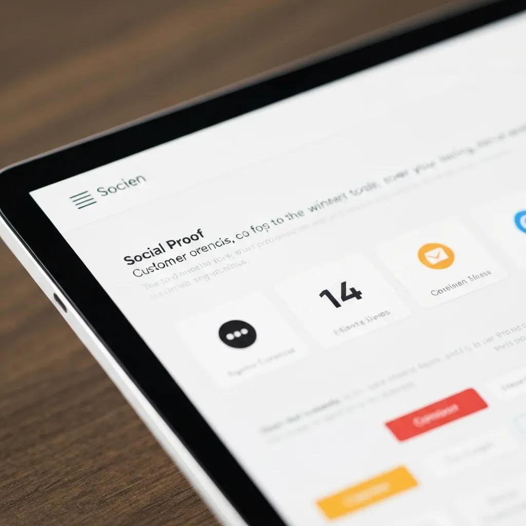
Social proof and trust signals reduce perceived risk by backing claims with third‑party or customer evidence: short testimonials with metrics, recognizable client logos (where permitted), review snippets, and guarantee badges placed near CTAs. Placement matters—put trust elements adjacent to CTAs and inside forms to counter hesitation at decision moments. Structured review data can help search visibility, but on‑page authenticity—recent, specific proof—resonates most.
Concise proof placed where users decide increases completions and lowers drop‑off during checkout or sign‑up.
How Conversion Psychology Shapes Design Decisions
Conversion psychology applies cognitive principles to guide attention and motivate action: visual hierarchy, scarcity/urgency cues, reciprocity, and reducing friction. Design focuses attention and lowers cognitive work; well‑timed psychological nudges encourage action. Psychology‑informed design produces higher CTRs, quicker decisions, and better campaign ROI because persuasion amplifies solid UX and copy.
Use psychological tactics ethically—prioritize clarity and real user value so you earn and keep trust while improving conversions.
How Visual Hierarchy Directs User Attention
Visual hierarchy steers attention with size, color contrast, spacing, and placement so visitors see the most important information first. The primary CTA and value statement should occupy the top visual tier; secondary actions should be smaller or visually muted. Good hierarchy reduces decision paralysis by moving users from the main benefit to supporting proof, then to action. Wireframes that use purposeful whitespace and contrast consistently drive higher engagement in usability tests.
Clear visual hierarchy cuts cognitive load and funnels users naturally toward the intended conversion path.
How Reducing Friction and Tapping Emotions Boosts Conversions
Lowering friction—fewer choices, shorter forms, pre‑filled fields—reduces the activation energy to convert. Emotional triggers like genuine urgency or reciprocity can accelerate decisions, but they must be authentic (for example, a real limited‑time onboarding bonus tied to capacity). Microcopy that reassures about security, data use, and next steps reduces anxiety and complements these triggers. Together, friction reduction and well‑placed emotional cues shorten the path from interest to action and lift completion rates.
The next section shows a repeatable methodology for applying these principles at scale.
Bloom Design ME’s Approach to Conversion‑First Websites
At Bloom Design ME we use a proprietary Visibility Boost Blueprint and a five‑step process to convert conversion principles into prioritized, measurable work. The Blueprint focuses on turning qualified visibility into clients through research‑driven UX fixes, targeted messaging, and tactical optimizations. Our five steps—Discovery, Strategy, Development, Launch, Maintenance—turn audits into prioritized builds and iterative A/B tests so improvements compound over time. Applied to the right traffic and offers, this conversion‑first system has helped clients grow client acquisition in the 2–5x range.
That framework ties directly to the principles above and sets clear expectations for scope, testing, and measurement.
How the Visibility Boost Blueprint Puts Principles into Practice
The Visibility Boost Blueprint turns audit insights into prioritized sprints: discovery finds high‑friction pages, strategy maps messaging and hierarchy, development implements UX and CTA fixes, launch runs tests, and maintenance measures and iterates. Each step links to a KPI—engagement, CTA CTR, form completion—so teams can tie lift to design decisions. For example: a discovery audit flags a weak hero; strategy prescribes a benefit headline and CTA; development ships the change; launch tests it; maintenance scales the winner. This closed‑loop process makes conversion work repeatable and measurable.
Mapping principles to execution removes guesswork and speeds validated improvements.
Florida Case Studies: Local Results, Measurable Impact
Local case studies show how the Blueprint moved metrics across Florida markets. An Orlando nonprofit focused on donations and volunteers improved conversions after clarifying the hero and adding targeted CTAs, landing near the lower end of our 2–5x expectation. A Tampa services firm cut mobile abandonment after a mobile‑first redesign and shorter forms, yielding a multi‑fold rise in qualified leads. A Miami small business increased engagement by adding trust signals and testing CTA language, producing sustained lead growth.
Those snapshots show how prioritized UX and conversion tactics, run through the Blueprint, produce measurable client acquisition across Florida. If you’re ready to diagnose quickly, we offer a Free Visibility Health Audit (valued at $367) to identify prioritized opportunities and next steps. The audit feeds directly into a strategy sprint and is available under selective client intake terms.
Quick CRO Tips You Can Apply Today
Start with low‑effort, high‑impact changes: speed up pages, tighten messaging, simplify forms, and instrument experiments to measure lift. The idea is to capture quick wins, measure impact, and then scale. These actions deliver near‑term gains and build the data foundation for larger UX investments.
Here are prioritized tactics you can implement in the next 30–90 days.
- Optimize page speed: Compress images, enable caching, and prioritize critical rendering to cut load time now.
- Clarify the hero: Test a benefit‑led headline and a single primary CTA that states the outcome.
- Reduce form friction: Remove non‑essential fields and use progressive profiling to improve completions.
- Add relevant social proof: Put short, recent testimonials near form CTAs to ease hesitation.
Run these in sequence so you can measure wins and focus resources on the highest‑return experiments. Below we break down two priorities—speed and microcopy—in more detail.
Why Site Speed Matters for Conversions
Speed matters because every extra second of load time increases abandonment and lowers the chance of conversion. Studies show measurable conversion loss per second of delay, so technical fixes translate directly into retained traffic and revenue. Start with compressing and modern‑formatting images, enabling browser caching, deferring noncritical JavaScript, and using a content delivery strategy. Track metrics like First Contentful Paint (FCP), Time to Interactive (TTI), and page‑level conversion rate to measure impact.
With a simple monitoring cadence and a short quick‑win checklist, you can see improvements in days that compound across paid and organic traffic.
Use that table to prioritize technical work and link fixes to conversion outcomes; regular monitoring keeps gains steady under real traffic.
Microcopy and Messaging That Boost Engagement
Microcopy reduces anxiety and clarifies next steps at key moments—form fields, errors, and CTA hover states. The best microcopy is benefit‑focused, reassures about privacy or time commitment, and gives specific action cues (for example, “Get a 3‑step plan” instead of “Submit”). A/B test microcopy near CTAs and field labels to measure micro‑conversion lifts. Keep lines short and aligned with your headline to minimize cognitive load.
Because small text changes remove friction at decision points, microcopy often produces outsized lifts—iterate based on analytics and user feedback.
If you want to turn these quick wins into a structured growth program, start with a diagnostic: request a Free Visibility Health Audit (valued at $367) to surface prioritized opportunities and an implementation roadmap. Bloom Design ME uses the Visibility Boost Blueprint selectively to convert visibility into measurable client acquisition, following the five‑step process so changes are tested and scaled.
- Audit: Find top friction points and conversion bottlenecks.
- Prioritize: Rank fixes by expected impact and effort.
- Test: Run controlled experiments and measure KPIs.
- Scale: Roll out winners across high‑value pages.
Those iterative cycles make conversion‑focused design a repeatable growth engine that captures more value from the traffic you already have.
Frequently Asked Questions
What common design mistakes hurt conversions?
The usual culprits are cluttered pages, vague CTAs, and slow load times. Clutter buries the key action. Vague CTAs confuse visitors about the next step. And slow pages lose people before they see your offer. Keep layouts focused, CTAs explicit, and performance optimized to maximize conversions.
How does A/B testing improve conversion rates?
A/B testing compares two versions of a page to see which converts better. Test headlines, images, CTA language, placement—one change at a time—and measure micro‑conversions to understand what truly moves the needle. Data from A/B tests lets you make confident design decisions and scale winners sitewide.
What role does content play in conversion‑focused design?
Content communicates value and guides decisions. Good content addresses user needs, removes objections, and points to a clear next step. Keep it concise, benefit‑driven, and aligned with your visual hierarchy. Well‑written content both engages users and helps SEO attract the right visitors.
How important is mobile optimization for conversions?
Critical. With most traffic on mobile, a poor mobile experience costs conversions. Prioritize readable layouts, thumb‑friendly CTAs, and fast mobile performance. Designing for mobile first forces clarity that benefits all users.
Which metrics should I track to measure conversion success?
Track conversion rate, bounce rate, average session duration, and CTR. Conversion rate shows action completion, bounce rate flags abandonment, session duration indicates engagement, and CTR measures CTA effectiveness. Use these together to spot friction and validate improvements.
How do emotional triggers fit into website design?
Emotional triggers—urgency, scarcity, reciprocity, social proof—help motivate action but must be used honestly. Real deadlines, authentic testimonials, and clear value offers create urgency without eroding trust. Combine triggers with friction‑reduction for the best results.
Why is user feedback important for optimization?
User feedback gives direct insight into how people experience your site. Surveys, usability tests, and analytics reveal pain points you can fix. Regular feedback helps you prioritize changes that improve usability and conversion over time.